
neutral by design
When our 20V batteries started showing up on blue machines, the legacy orange label pulled focus in the wrong way. The quick fix would have been to swap orange for gray—but that would have ignored a bigger brand challenge. Evolution’s visual identity relies on two primaries: orange for the majority of tools, and blue for the dedicated metal-cutting line. With cordless metal-cutting tools on the horizon, we needed a labeling system that could thrive in both worlds.
Instead of a patch, we built a clean, neutral, and scalable label language—one that works across every tool, every amp-hour capacity, and every shelf presence. The brief: maintain the EXT mark integrity, work within the grey/white/black color palette, and ensure the hierarchy is bulletproof across the range of batteries.
Developing a flexible design that works across product lines

the brief, the boundaries, the opportunity
Two non-negotiables guided the redesign:
The EXT logo had to remain materially intact
The palette needed to stay neutral to avoid clashing with either orange or blue products.
Those boundaries created an opportunity. Rather than de-orange the label, we explored a visual language that elevated the EXT mark, simplified hierarchy, and built a foundation flexible enough to extend beyond the battery itself.
constraints sharpen the solution
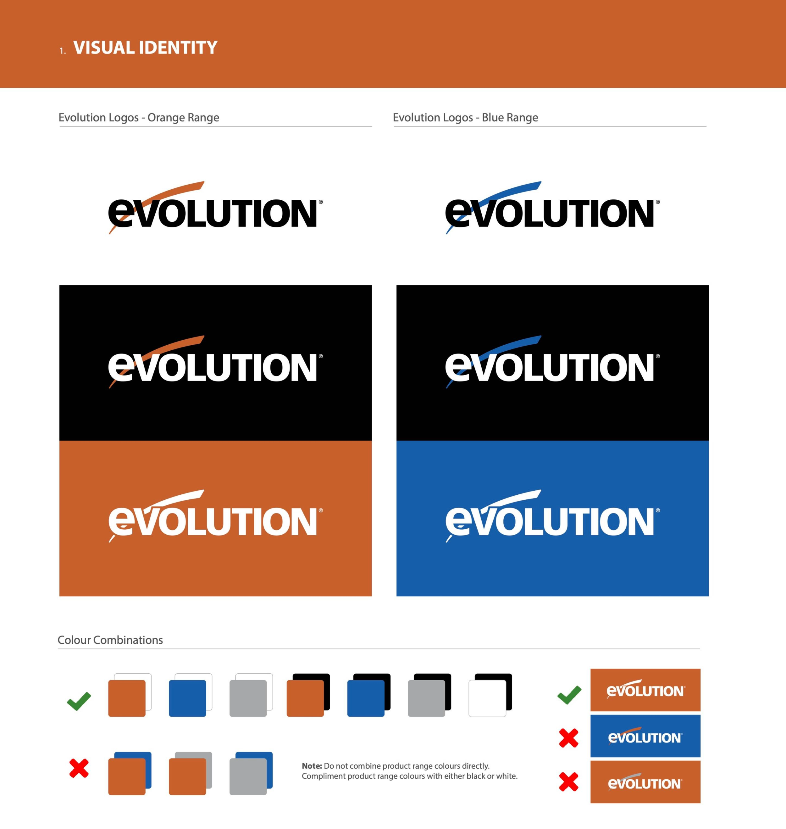
Two ranges, one brand: Orange = core tools, Blue = metal cutting. Each pairs with neutrals, never with each other.
exploration to alignment
testing, pushing, refining
Our early rounds explored bold diagonals, subtle fades, and shifts in typographic weight—all aimed at expressing Evolution’s “precision under power.” These directions gave us vocabulary, but through feedback and iteration, we pared down to what mattered most: legibility, clarity, and scalability. We enlarged the amp-hour callout for quick recognition, refined reversed-out options, and built a system that works as cleanly at a glance as it does up close.
see the evolution
the final label
The chosen design integrates the EXT mark seamlessly, clarifies type hierarchy, and scales across all four SKUs without reinventing the wheel. The enlarged amp-hour numerals make sorting simple, while the neutral field ensures the label complements both orange and blue housings. What could have been a liability became a flexible system asset.