neutral by design
solving the orange vs. blue conundrum
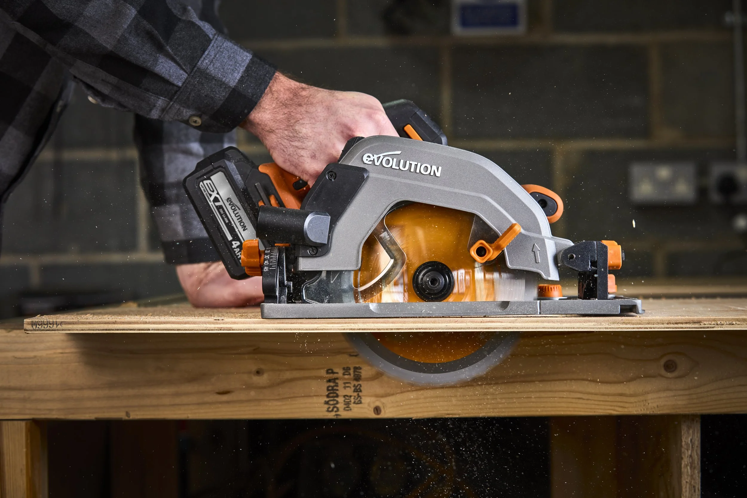
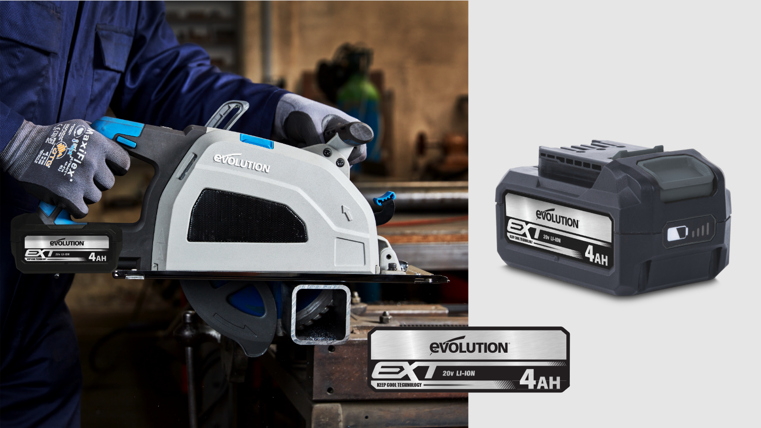
Evolution’s batteries needed to work across two distinct ranges—orange for core tools and blue for metal cutting. The legacy orange label clashed with blue housings, creating inconsistency. Instead of a quick color swap, we developed a revised neutral label architecture that complements both lines and scales across every amp-hour capacity.

the brief, the boundaries, & the opportunity
Two non-negotiables shaped the redesign:
The EXT logo had to stay intact.
The palette had to remain neutral, complementing both orange and blue products.
Instead of simply stripping color, those limits opened a door. We developed a visual language that gave the EXT mark center stage, clarified the hierarchy, and laid the groundwork for a standardized system that could be extended across the brand.
A nod to metal, built into the label
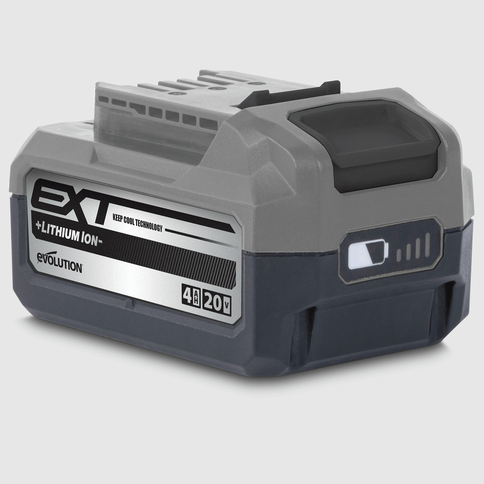
Early in the process, we chose to print on a substrate that emulates sheet metal. With the palette restricted, texture became a tool to elevate aesthetics and a nod to Evolution’s metal-cutting heritage. More than a design flourish, it reinforced the brand’s professional positioning, distancing Evolution from the perception of being a bargain-bin tool line.
About Evolution’s Visual Identity
Evolution tools are divided into two distinct ranges: the Orange Range, representing the majority of our tools, and the Blue Range, dedicated to our metal-cutting line. Both ranges can be paired with neutrals—such as white, gray, or black—but we never combine orange and blue directly. This separation ensures that each line maintains its own clarity while operating under a single, cohesive brand system.
constraints sharpen the solution
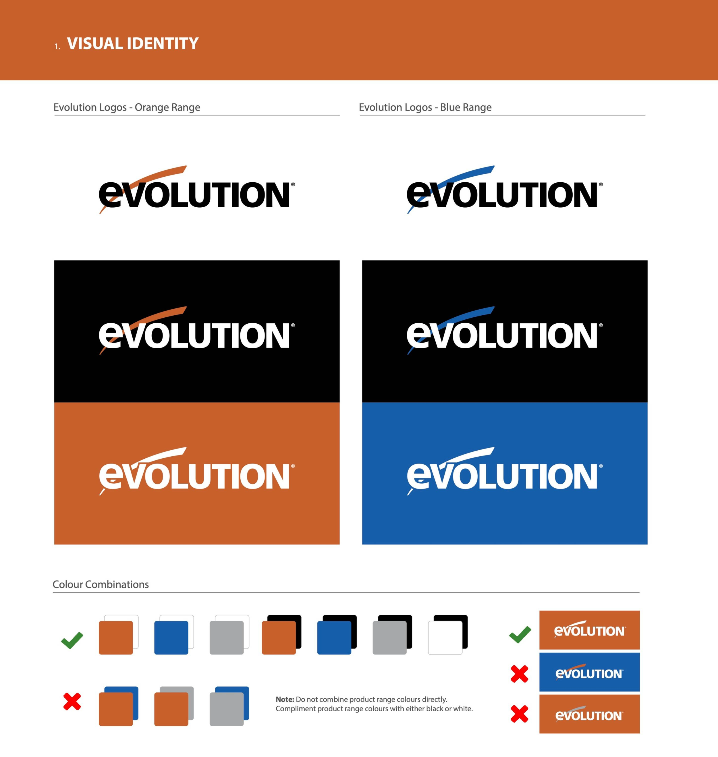
Two ranges, one brand: Orange = core tools, Blue = metal cutting. Each pairs with neutrals, never with each other.

exploration to alignment
testing, pushing, refining
Our early rounds explored bold diagonals, subtle fades, and shifts in typographic weight—all aimed at expressing Evolution’s “precision under power.” These directions gave us vocabulary, but through feedback and iteration, we pared down to what mattered most: legibility, clarity, and scalability. We enlarged the amp-hour callout for quick recognition, refined reversed-out options, and built a system that works as cleanly at a glance as it does up close.
see the evolution
iterations in motion
Design mastery, like BMX, comes from repetition and refinement. Every variation teaches something new and moves the idea closer to clarity. These iterations represent that pursuit—testing boundaries, rejecting what doesn’t hold up, and proving the final direction by exploring every possible path.
the refined solution
Through rounds of review with the marketing manager and other key stakeholders, the label evolved in measured steps. As is often the case, the Evolution wordmark was enlarged for stronger brand presence, while other refinements ensured balance and manufacturability. This process also introduced a new element into the visual vocabulary: the diagonal fade. Applied subtly across amp-hour variants and later in the product catalog, it provides a sense of motion and precision. This energetic detail reinforces Evolution’s positioning without overwhelming the neutral palette.

Built with the same precision we promise
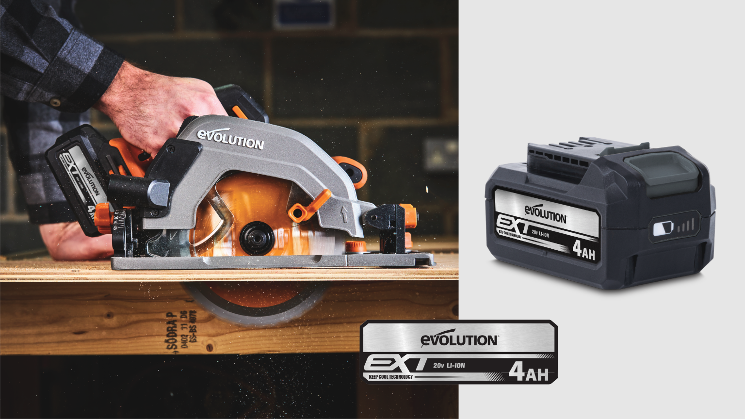
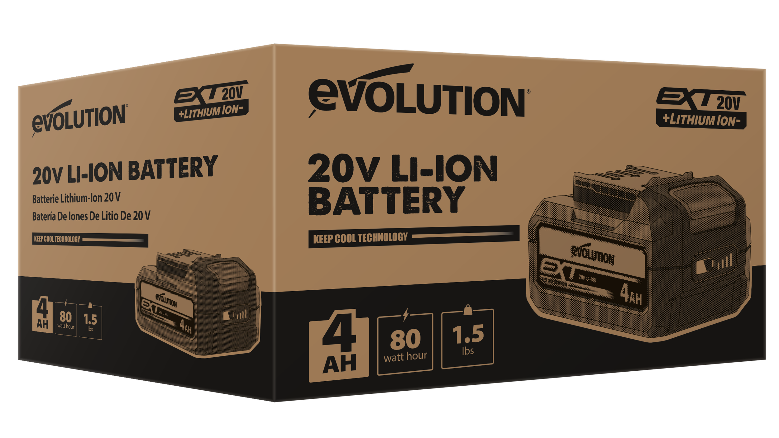
The chosen design seamlessly integrates the EXT mark, clarifies the type hierarchy, and scales across all SKUs without requiring reinvention.
The enlarged amp-hour numerals make sorting simple, while the neutral field ensures the label complements both orange and blue product lines. What could have been a liability became a flexible system asset.
across every amp hour
one system, four SKUs
The new architecture repeats across 2Ah, 4Ah, 5Ah, and 8Ah capacities. Grid rules maintain tight alignment, the “Keep Cool Technology” claim remains in place, and the spec line remains readable under shop conditions. The diagonal fade becomes a unifying accent, anchoring the design language across capacities while adding a distinct signature element that extends beyond the battery to other brand touchpoints.

beyond the battery
extending the language across chargers and packaging
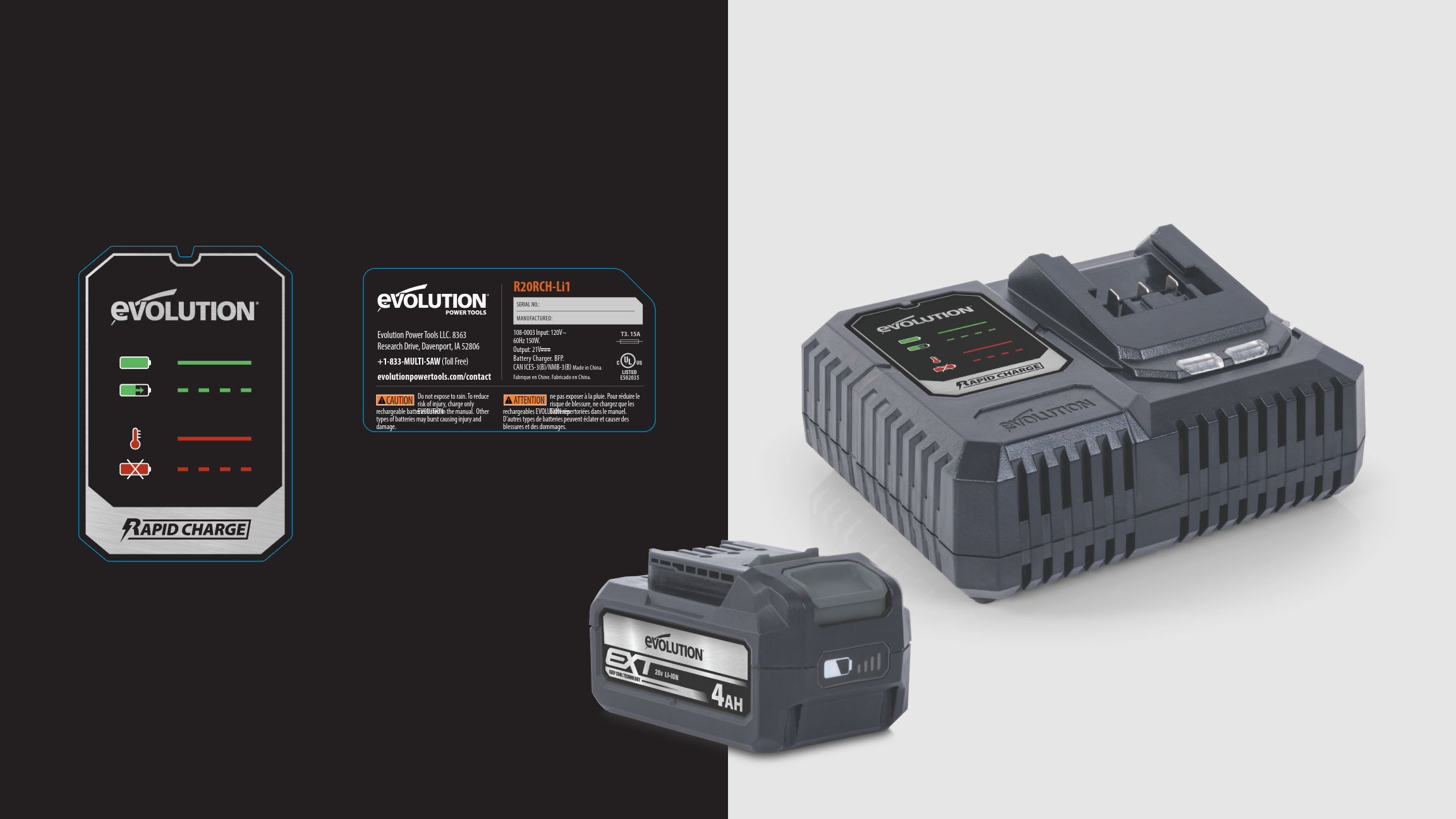
With the battery system locked, we extended the same principles to chargers and retail packaging. The charger faceplate required only a simple neutralization step, removing the orange color to maintain consistency with the updated battery labels. The packaging was more involved, transitioning from a full four-color print to a one-color execution that reduced costs and simplified production while maintaining clarity on the shelf. The result is a unified look—cleaner icons, streamlined compliance copy, and packaging that tells a consistent story across every touchpoint.
why it matters
This wasn’t just a label tweak—it was a system refinement. By solving a visual inconsistency, we created a foundation for consistency, manufacturability, and brand equity across two product lines. The new neutral direction strengthened Evolution’s shelf presence while proving that small surfaces can have a significant brand impact.